Pandas Example
We are now ready to pull together what we have learned about Pandas and work through a detailed example. It will be based on the American baseball player Mike Trout’s statistics, through 2019. To follow along, download the data file.
Start by reading it into a Pandas Dataframe.
import pandas as pd
import matplotlib.pyplot as plt
import matplotlib.ticker as ticker

#read data from the csv file into a Dataframe object called 'df'
df = pd.read_csv("MikeTroutData.csv")

#extract columns into variables.
year = df['Year']
hits = df['H']
at_bats = df['AB']
home_runs = df['HR']
salary = df['Salary']
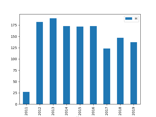
Make a simple bar plot showing hits on the Y axis, year on the X axis. If we are willing to accept all the defaults, all that is necessary is to invoke the Matplotlib bar method directly on a subset of the Dataframe.
df.plot.bar(x="Year",y="H")
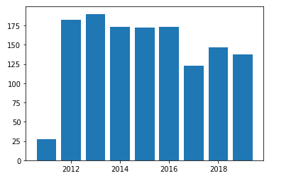
We can also use Matplotlib directly with our extracted variables. The figure() method advances to a new plot.
plt.figure()
plt.bar(year, hits)
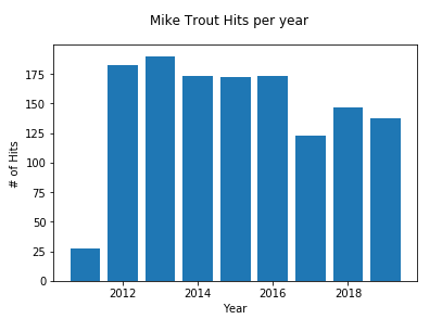
Let’s add some labels to make this more readable.
plt.xlabel('Year')
plt.ylabel('# of Hits')
plt.suptitle('Mike Trout Hits per year')
plt.bar(year, hits)
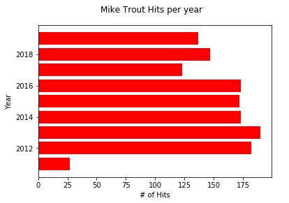
Turn it into a horizontal barchart and change the color of the bars.
plt.figure()
plt.xlabel('# of Hits')
plt.ylabel('Year')
plt.suptitle('Mike Trout Hits per year')
plt.barh(year, hits, color='red')
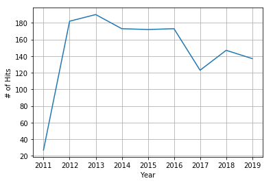
Make a line plot using the .plot() function instead of a barchart.
plt.figure()
plt.xlabel('Year')
plt.ylabel('# of Hits')
plt.grid()
plt.plot(year, hits)
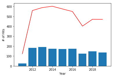
We can superimpose a line and a bar plot. We will represent ‘At Bats’ by a red line and ‘Hits’ by blue bars.
plt.figure()
plt.xlabel('Year')
plt.ylabel('# of Hits')
plt.plot(year, at_bats, color='red')
plt.bar(year, hits)
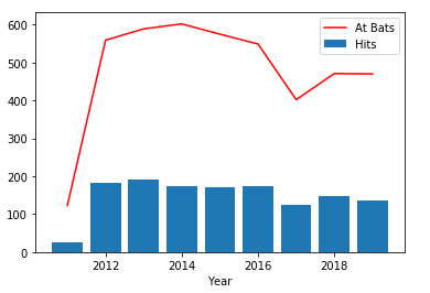
The y-label we used before is no longer appropriate, so let us add a legend.
plt.figure()
plt.xlabel('Year')
plt.plot(year, at_bats, color='red', label='At Bats')
plt.bar(year, hits, label='Hits')
plt.legend()
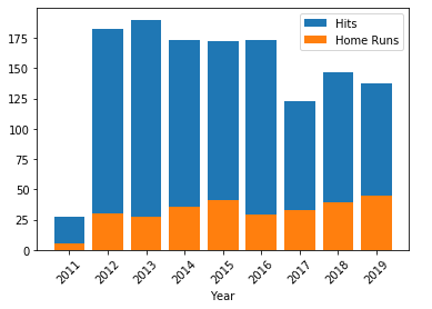
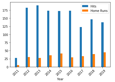
Without an intervening figure() method, plots will be stacked. We can utilize that to stack the bars. We are also rotating the x-axis tick marks and labels 45 degrees.
plt.figure()
plt.xlabel('Year')
plt.bar(year, hits, label='Hits')
plt.bar(year, home_runs, label='Home Runs')
plt.legend()

plt.xlabel('Year')
plt.xticks(rotation=45)
plt.xticks(year)                #shows all years in label
To make a grouped bar chart, do the same as a stacked bar and move the position of one of the bars as shown below. Notice that for the second bar(), the first argument is ‘year+.2’. This shifts the position on the x-axis .2 units to the right of the default starting point.
plt.xlabel('Year')
plt.xticks(rotation=45)
plt.xticks(year)                #shows all years in label

plt.bar(year, hits, width=.2, label='Hits')
plt.bar(year+.2, home_runs, width=.2, label='Home Runs')
plt.legend()
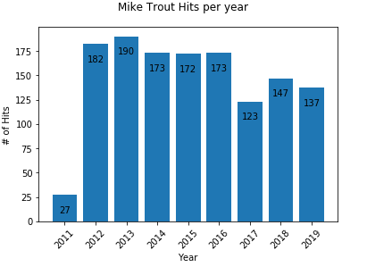
Suppose you are interested in exactly how many hits each bar represents. We can iterate over each bar to label it with the corresponding number.
plt.xlabel('Year')
plt.xticks(rotation=45)
plt.xticks(year)                #shows all years in label

plt.ylabel('# of Hits')
plt.suptitle('Mike Trout Hits per year')

for bar in plt.bar(year, hits):
    plt.text(bar.get_x() + .4,              #x position of label
             bar.get_height() - 20,         #y position of label
             bar.get_height(),              #actual value of label
             ha='center',
             va='bottom')
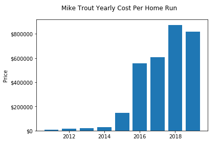
Let’s plot how much Mike Trout is paid per home run.
cost_per_home_run = salary/home_runs

plt.xlabel('Year')
plt.xticks(rotation=45)
plt.xticks(year)

#change Y Axis to show dollar amount
fig, ax = plt.subplots()
formatter = ticker.FormatStrFormatter('$%1.0f')
ax.yaxis.set_major_formatter(formatter)

plt.ylabel('Price')
plt.suptitle('Mike Trout Yearly Cost Per Home Run')
plt.bar(year, cost_per_home_run)
Many plotting options can be applied directly to the Dataframe object, without the need to extract the variables. See the documentation for the Pandas plot method.
Exercise
Download the data file and work through the example.
Resources
Many Pandas tutorials are available online. A good starting point is here.
A repository of pandas practice projects is located here