Matplotlib
Most of our sample scripts in this section are taken directly from the Matplotlib gallery.
One-Dimensional Plots
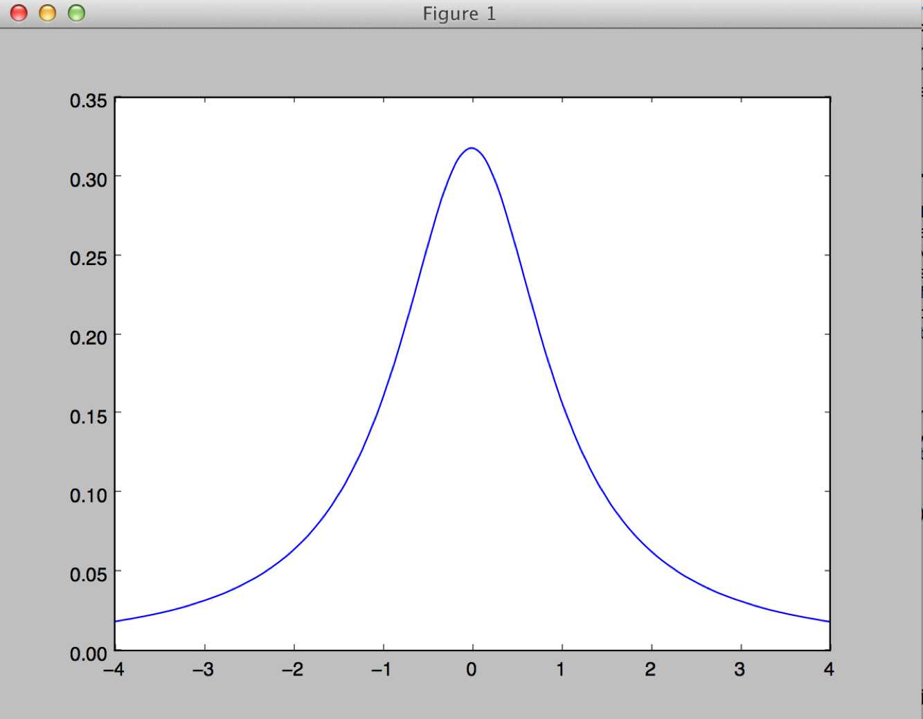
A simple example:
import numpy as np
import matplotlib.pyplot as plt
x=np.linspace(-4.,4.,401)
y=1./(np.pi*(1.+x**2))
plt.plot(x,y)
plt.show()
This results in
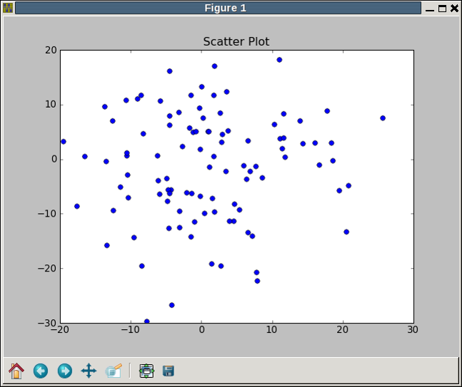
Let us write a more sophisticated example. This is a scatter plot with points randomly placed according to a normal distribution.
Contents of scatter_plot.pyimport numpy as np
import matplotlib.pyplot as plt
fig = plt.figure()
ax = fig.add_subplot(111)
ax.plot(10*np.random.randn(100),10*np.random.randn(100), 'o')
ax.set_title('Scatter Plot')
plt.show()
We can place more sophisticated labeling or multiple plots on a graph with subplot
import numpy as np
import matplotlib.pyplot as plt
x1 = np.linspace(0.0, 5.0)
x2 = np.linspace(0.0, 2.0)
y1 = np.cos(2 * np.pi * x1) * np.exp(-x1)
y2 = np.cos(2 * np.pi * x2)
plt.subplot(2, 1, 1)
plt.plot(x1, y1, 'yo-')
plt.title('A tale of 2 subplots')
plt.ylabel('Damped oscillation')
plt.subplot(2, 1, 2)
plt.plot(x2, y2, 'r.-')
plt.xlabel('time (s)')
plt.ylabel('Undamped')
plt.show()
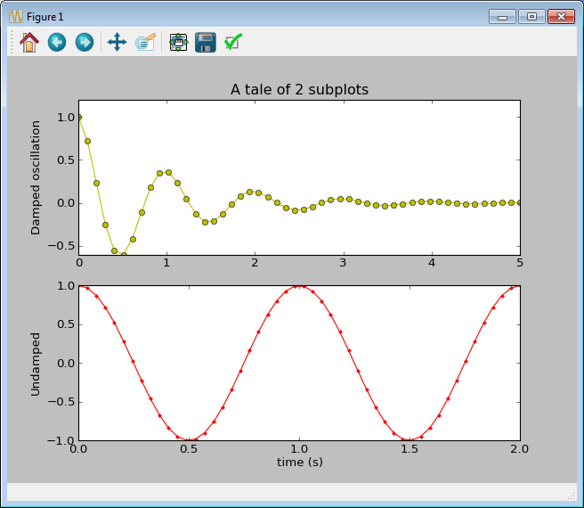
Many other options are available for annotations, legends, and so forth.
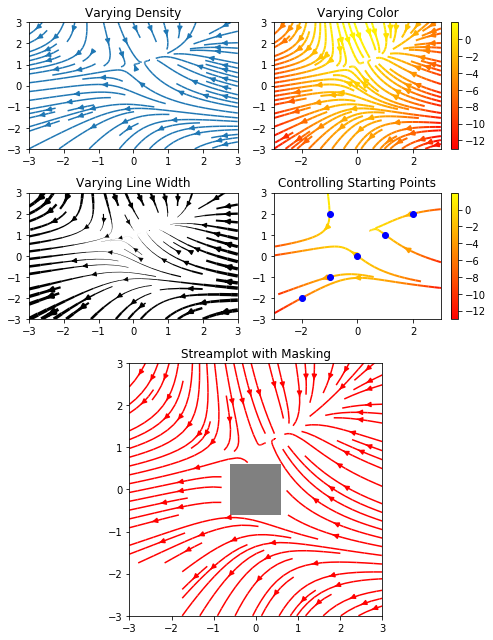
More advanced plots are provided. The following demonstrates streamlines for vector fields, such as fluid flows.
Contents of streamlines.pyimport numpy as np
import matplotlib.pyplot as plt
import matplotlib.gridspec as gridspec
w = 3
Y, X = np.mgrid[-w:w:100j, -w:w:100j]
U = -1 - X**2 + Y
V = 1 + X - Y**2
speed = np.sqrt(U**2 + V**2)
fig = plt.figure(figsize=(7, 9))
gs = gridspec.GridSpec(nrows=3, ncols=2, height_ratios=[1, 1, 2])
# Varying density along a streamline
ax0 = fig.add_subplot(gs[0, 0])
ax0.streamplot(X, Y, U, V, density=[0.5, 1])
ax0.set_title('Varying Density')
# Varying color along a streamline
ax1 = fig.add_subplot(gs[0, 1])
strm = ax1.streamplot(X, Y, U, V, color=U, linewidth=2, cmap='autumn')
fig.colorbar(strm.lines)
ax1.set_title('Varying Color')
# Varying line width along a streamline
ax2 = fig.add_subplot(gs[1, 0])
lw = 5*speed / speed.max()
ax2.streamplot(X, Y, U, V, density=0.6, color='k', linewidth=lw)
ax2.set_title('Varying Line Width')
# Controlling the starting points of the streamlines
seed_points = np.array([[-2, -1, 0, 1, 2, -1], [-2, -1, 0, 1, 2, 2]])
ax3 = fig.add_subplot(gs[1, 1])
strm = ax3.streamplot(X, Y, U, V, color=U, linewidth=2,
cmap='autumn', start_points=seed_points.T)
fig.colorbar(strm.lines)
ax3.set_title('Controlling Starting Points')
# Displaying the starting points with blue symbols.
ax3.plot(seed_points[0], seed_points[1], 'bo')
ax3.set(xlim=(-w, w), ylim=(-w, w))
# Create a mask
mask = np.zeros(U.shape, dtype=bool)
mask[40:60, 40:60] = True
U[:20, :20] = np.nan
U = np.ma.array(U, mask=mask)
ax4 = fig.add_subplot(gs[2:, :])
ax4.streamplot(X, Y, U, V, color='r')
ax4.set_title('Streamplot with Masking')
ax4.imshow(~mask, extent=(-w, w, -w, w), alpha=0.5,
interpolation='nearest', cmap='gray', aspect='auto')
ax4.set_aspect('equal')
plt.tight_layout()
plt.show()
Matplotlib can also make histograms, pie charts, and so forth. These are commonly used with Pandas, and Pandas can access them directly, as we will see.
Higher-Dimensional Plots
For higher-dimensional plots we can use contour, contourf, surface, and others.
Contour plot example: Contents of contour.py
import matplotlib
import numpy as np
import matplotlib.cm as cm
import matplotlib.pyplot as plt


delta = 0.025
x = np.arange(-3.0, 3.0, delta)
y = np.arange(-2.0, 2.0, delta)
X, Y = np.meshgrid(x, y)
Z1 = np.exp(-X**2 - Y**2)
Z2 = np.exp(-(X - 1)**2 - (Y - 1)**2)
Z = (Z1 - Z2) * 2
fig, ax = plt.subplots()
CS = ax.contour(X, Y, Z)
ax.set_title('Simple Contour Plot')
plt.show()
The meshgrid function takes two rank-1 arrays and returns two rank-2 arrays, with each point labeled with both x and y values. Notice how NumPy array operations are used to compute the function values from the meshgrid arrays.
Surface plots require the mplot3d package and some additional commands to set views and sometimes lighting.
# This import registers the 3D projection, but is otherwise unused.
from mpl_toolkits.mplot3d import Axes3D  # noqa: F401 unused import

import matplotlib.pyplot as plt
from matplotlib import cm
from matplotlib.ticker import LinearLocator, FormatStrFormatter
import numpy as np


fig = plt.figure()
ax = fig.gca(projection='3d')

# Make data.
X = np.arange(-5, 5, 0.25)
Y = np.arange(-5, 5, 0.25)
X, Y = np.meshgrid(X, Y)
R = np.sqrt(X**2 + Y**2)
Z = np.sin(R)

# Plot the surface.
surf = ax.plot_surface(X, Y, Z, cmap=cm.coolwarm,
                       linewidth=0, antialiased=False)

# Customize the z axis.
ax.set_zlim(-1.01, 1.01)
ax.zaxis.set_major_locator(LinearLocator(10))
ax.zaxis.set_major_formatter(FormatStrFormatter('%.02f'))

# Add a color bar which maps values to colors.
fig.colorbar(surf, shrink=0.5, aspect=5)

plt.show()
Recent versions of Matplotlib can apply style sheets to change the overall appearance of plots. For example, NumPy has modified its default style, but the older one (shown in some of our illustrations) is available as “classic.” Matplotlib can also be styled to imitate the R package ggplot. See the
gallery
for the possibilities.
Exercise
-
Type into your choice of Spyder’s interpreter pane or a JupyterLab cell the example plotting codes we have seen so far. These were all taken from the Matplotlib gallery.
-
In the contour plot example, change
contourtocontourfand observe the difference.
Seaborn
Seaborn is a package built upon Matplotlib that is targeted to statistical graphics. Seaborn can be used alone if its defaults are satisfactory, or plots can be enhanced with direct calls to Matplotlib functions.
Seaborn 0.9 or later is needed for the “relationship” plot example below. This example uses a built-in demo dataset.
Contents of seaborn_demo.pyimport numpy as np
import matplotlib.pyplot as plt
import seaborn as sns
fmri = sns.load_dataset("fmri")
sns.relplot(x="timepoint", y="signal", col="region",
hue="event", style="event",
kind="line", data=fmri);
plt.show()
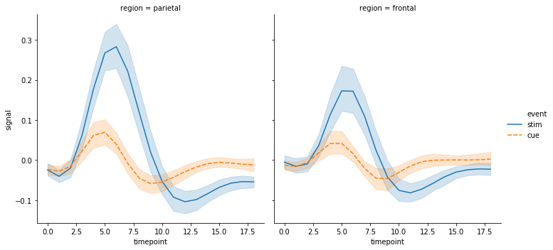
Many other statistical plots are available including boxplots, violin plots, distribution plots, and so forth. The next example is a heatmap.
Contents of seaborn_demo2.pyimport matplotlib.pyplot as plt
import seaborn as sns
sns.set()
# Load the example flights dataset and conver to long-form
flights_long = sns.load_dataset("flights")
flights = flights_long.pivot("month", "year", "passengers")
# Draw a heatmap with the numeric values in each cell
f, ax = plt.subplots(figsize=(9, 6))
sns.heatmap(flights, annot=True, fmt="d", linewidths=.5, ax=ax)
plt.show()
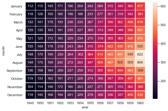
The call to sns.set() imposes the default Seaborn theme to all Matplotlib plots as well as those using Seaborn. Seaborn provides a number of methods to modify the appearance of its plots as well as Matplotlib plots created while the settings are in scope. For many examples see their
tutorial on styling plots.
Seaborn’s documentation can be found here